UX Design / Design / Art Direction
Amazon Outbound | Email
The client:
Amazon Outbound
The situation:
The Amazon Outbound team wanted their email outreach design to be streamlined through a multi-content template that would make it easier for their 1,800 siloed business teams to send emails from a single design voice. They had already designed some of the template, and wanted UX and design guidance and recommendations.
Pain points:
Lack of central marketing strategy has led to customer experience challenges that have caused customers to disengage. Inconsistent content and designs coming from Amazon depending on which business teams sent it.
Work:
Based on their new design, we provided options that aligned with and pushed past their expectations. We showed how the template works for different use-cases (active and inactive users) utilizing our UX strategies and new component designs.
Roles & responsibilities:
UX design.
I contributed guidance, recommendations, and rationales to the design team as well as the Amazon clients.
Impact:
The clients were happy and very appreciative of our work and our thinking. They said they value our agency a lot and that they are applying what they learned from our presentations and points of view.
Kinecta | Landing Pages + Website
The client:
Kinecta Credit Union
The situation:
Kinecta’s digital engagement is fairly low compared to its competitors.
Pain points:
Antiquated designs and lack of UX strategies
Work:
We create processes that involve UX strategies, implement UX considerations, and layout testing, through the creation of landing pages. We use the learnings from the landing pages to optimize the main website.
Roles & responsibilities:
UX design, web design, art direction, web builder.
I designed all the landing pages based on the existing brand but with many UX and design enhancements.
Impact:
Kinecta saw a massive increase in engagement and conversions, and have expressed gratitude for the work we’ve done multiple times during project meetings.
Kinecta | Form Field COmponent
The client:
Kinecta Credit Union
The situation:
Kinecta felt their questionnaire form design (for the mortgage application) was confusing and potentially deterred from higher completion rates.
Pain points:
The spacing in between fields were ambiguously close to each other and it was less obvious which label referred to which field. The high contrast in the component unnecessarily drew too much attention in relation to the other components.
Work:
Using current best practices, I designed the new component to have clearer hierarchy, centered the questionnaire to be focused more on the users’ needs, front-loaded the less commitment-expensive items and saved the most commitment-expensive ones for last, utilized the law of common region and created groupings that made sense, and built the component to have more flexible options for the designer/content author.
Roles & responsibilities:
UX design, web design, art direction.
I created the new field from scratch in Figma based on the clients’ needs. Before implementation, I delivered all active/inactive and error states. After build, I worked with the developer to ensure quality of execution.
Impact:
The form was received well with compliments for the design from both the internal team and the clients.
Old design form.
New design form.
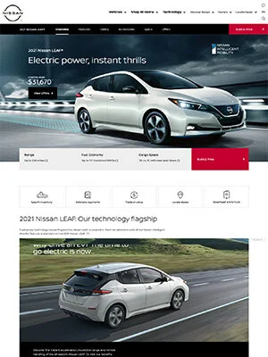
Nissan | Digital Brochure + Website
The client:
Nissan USA
The situation:
The Designory creatives had to transition from using Adobe Xd to Figma when creating layouts for Nissan’s website and digital brochures.
Pain points:
There was a learning curve that came with the transition, but an opportunity to design more efficiently. Also, as we were all working as we were learning, there were many different ways that components were built based on which designer created it first.
Work:
I rallied the Group Creative Director and ACDs to tap into the potential of Figma more with a design system. After creating the entire design system library and template for the website, I did the same with for the digital brochure with some help. We have made improvements to the components every year to optimize the design process more and more.
Roles & responsibilities:
UX design, library system design
I built and designed the initial structure and naming convention for the design systems for Nissan. Afterwards, I trained and guided the ACDs on how to use, build, edit, and improve the systems.
Impact:
The designers reduced their design time by 75% and were able to focus on the content more. Many of them have shared tremendous praise for the system, saying it has saved them a lot of time from having to work on the tedious aspects of the process.
Designory+ | Website
The client:
Designory+
The situation:
The Designory is combining with EG+ and needs a new website. They want something that will wow, communicate, and impress.
Pain points:
There are many stakeholders from around the world that need to be impressed. The website needs to feel new without making it feel like it is becoming a different agency, but still communicate amazing capability to service clients at the highest levels.
Work:
We were split into two teams to come up with user interactive comps/mockups as a preliminary exploration. Four concepts were eventually sent to the stakeholders for approval and the one I created was chosen.
Roles & responsibilities:
UX design, art direction, prototype design
I came up with many concepts and ideas for interactions that pushed the ideas we were trying to communicate. In the end, the layout I designed and prototyped was chosen as the base of inspiration for the website’s design.
Impact:
The stakeholders were able to visualize different interaction ideas through different concepts and get clearer on the direction they wanted the website to go in.
Website DesignS
Web design, online advertising, promotional units, web banners, and social media posts are among my digital capabilities. Some of the digital properties I've worked on include Nissan (new global template on AEM, North America’s site, and the NISMO brand), Honda (national, regional, certified used, corporate), Acura, Farmers Insurance, Mandalay Bay, La-Z-Boy, AMPM, ARCO, and Intuit.
On You | Website Creation
I pushed the creativity to represent On You Clothing’s mood, while keeping their contemporary clothing wholesale business needs a priority. From start to finish, I looked into the brand to discover the voice of the business. From there, I strategized the content to deliver impactful stories, guiding users through an intended flow.
Here’s a look at the planning and design:
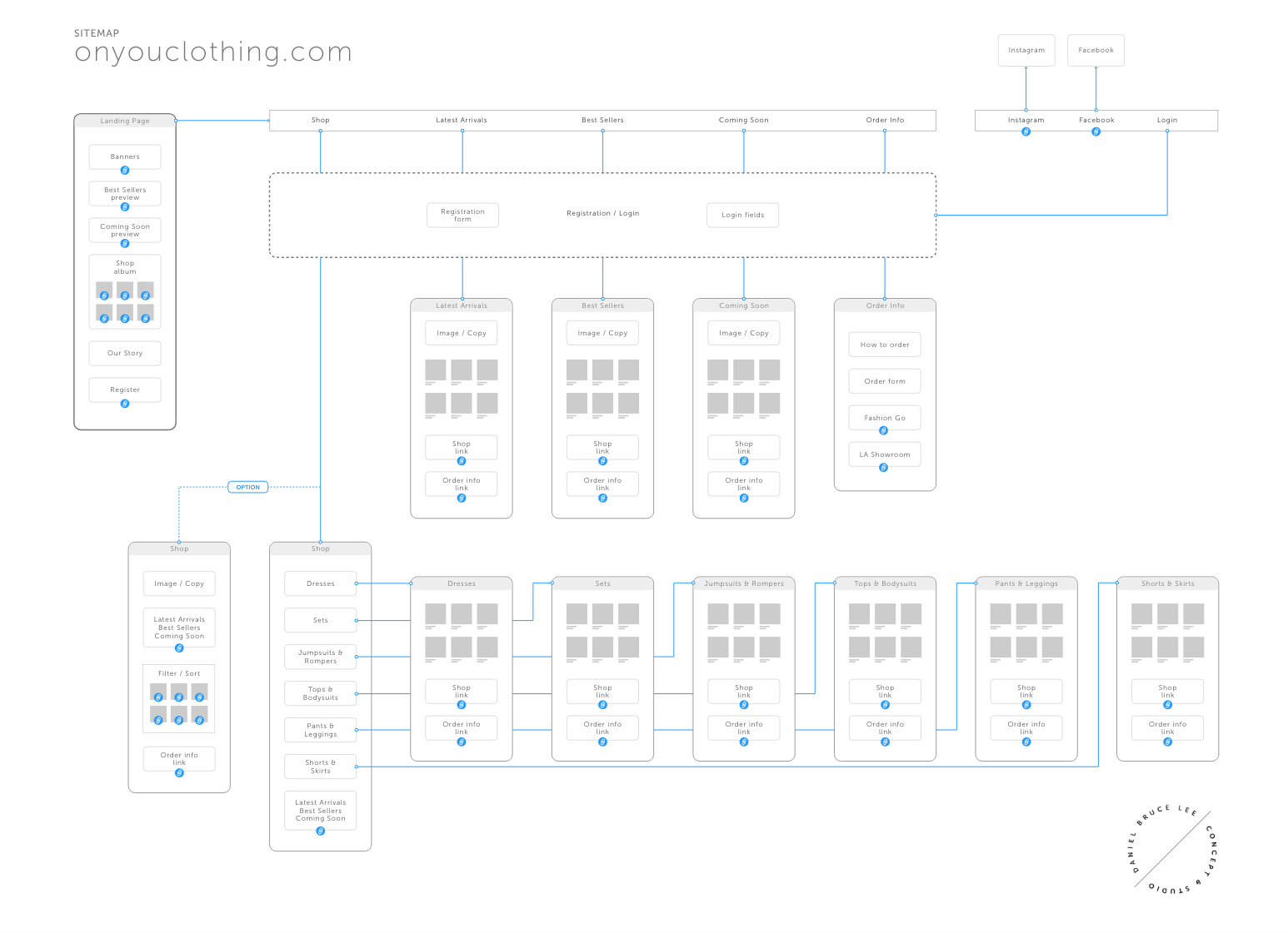
Sitemap and planning
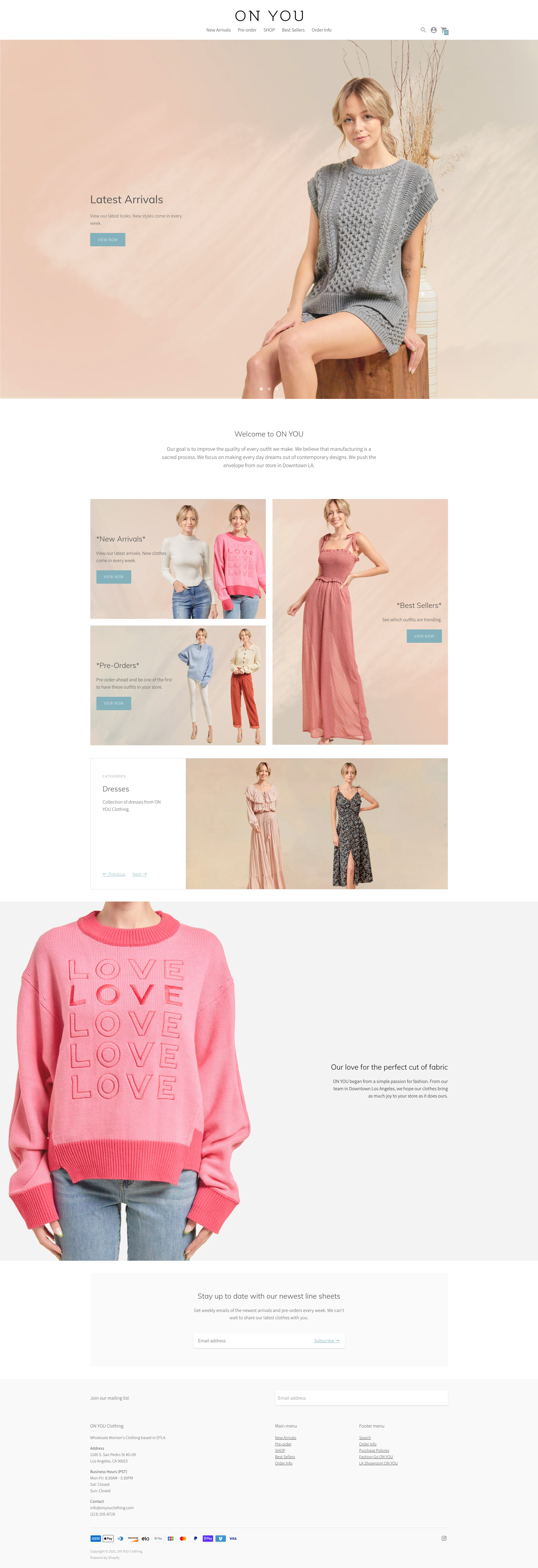
On You Clothing website launch
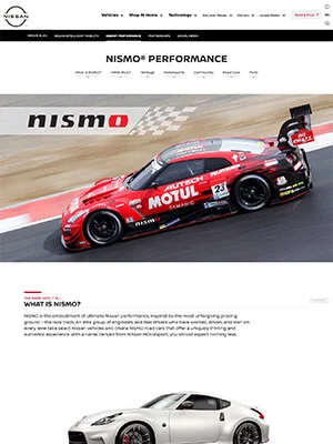
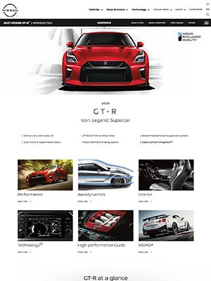
Nissan | Print Brochures
The first example is a GT-R brochure (16 pages) update, including a newly designed Nismo spread. The second example is the NissanConnect brochure, created from conception to execution all the way through.
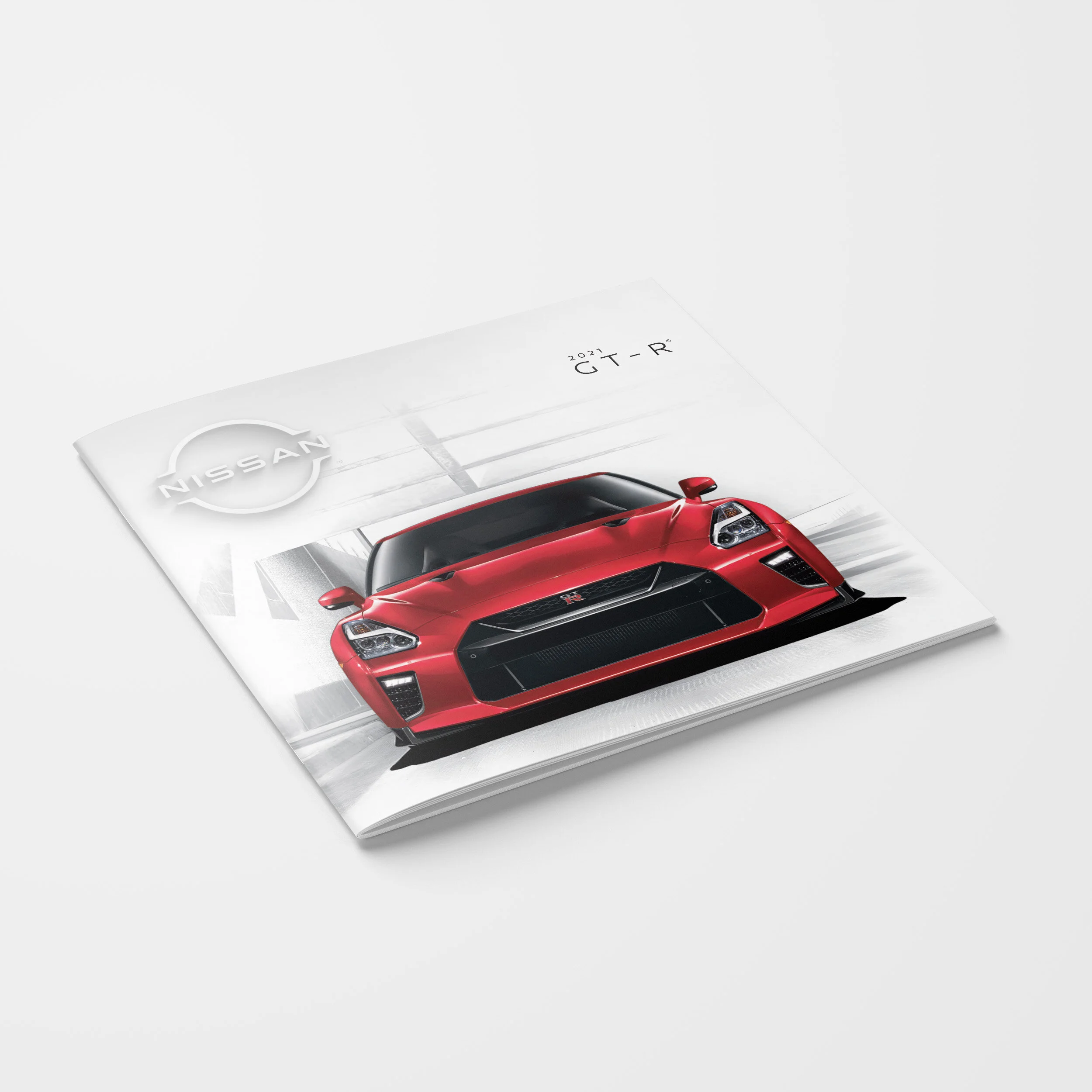
2021 Nissan GT-R print brochure


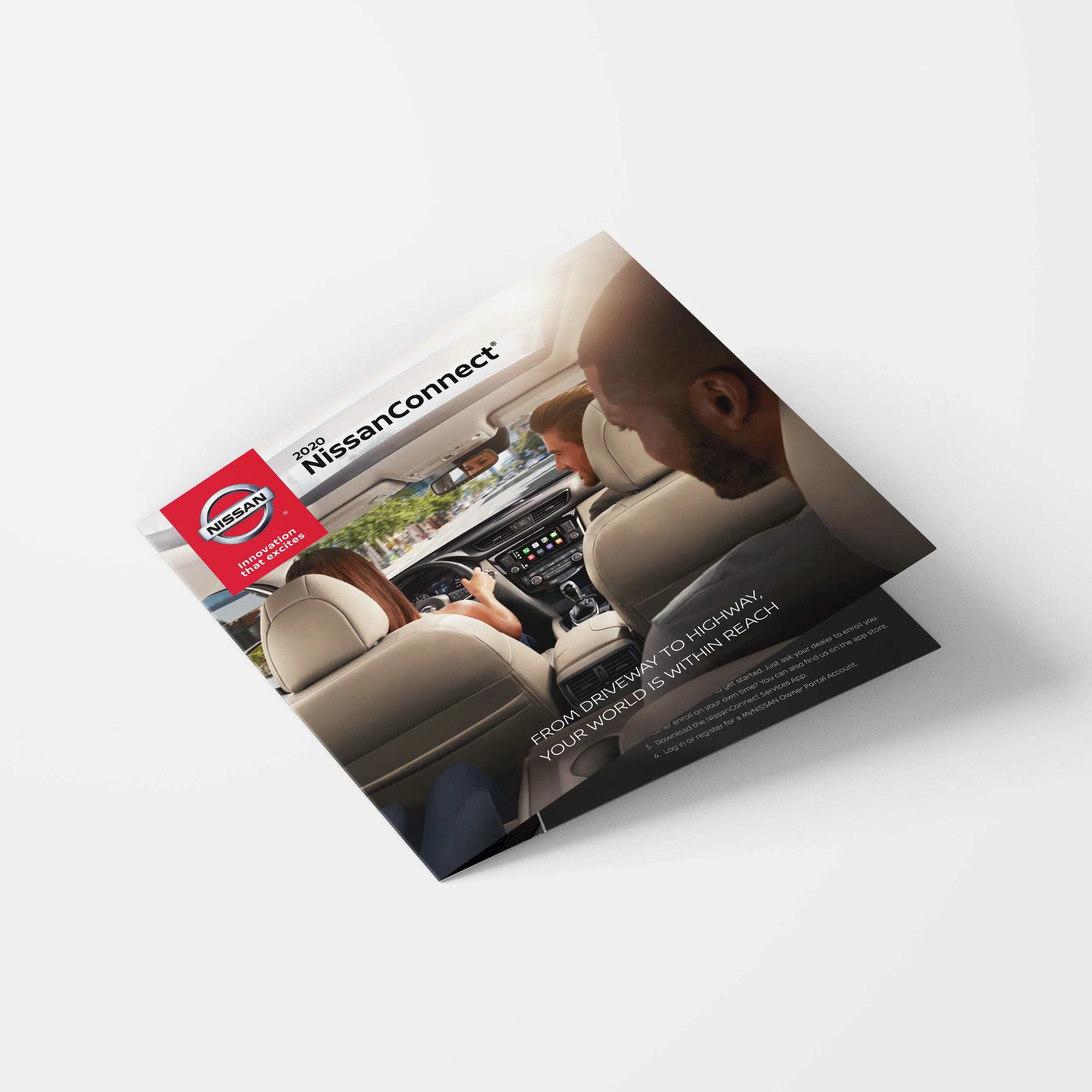
2020 NissanConnect print brochure
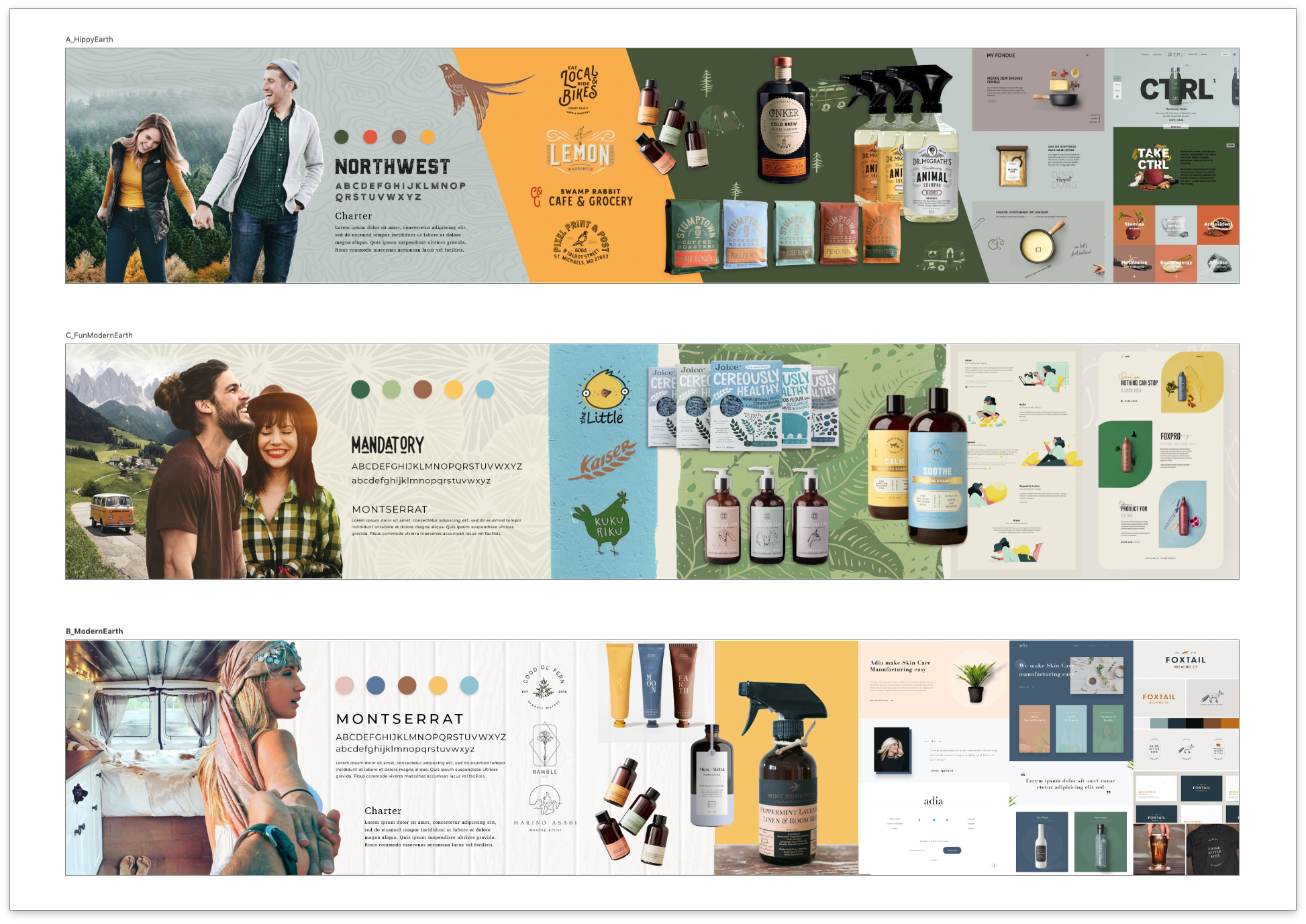
Birds | Mood Board Designs
Branding explorations for an outdoor-centric vehicle accessory company helping those on the road feel at home. These beefed up moodboards are in the vein of “stylescapes” and capture the essence and feel of a brand before any executions. This preliminary work helps manage client expectations upfront, so everyone is on the same page early in the process.